The Problem
As Sollective grew, so did the breadth of its offerings, spanning:
- Freelancer Matching Services
- Workflow Tools
- A Thriving User Community
However, the existing website fell short in several critical areas:
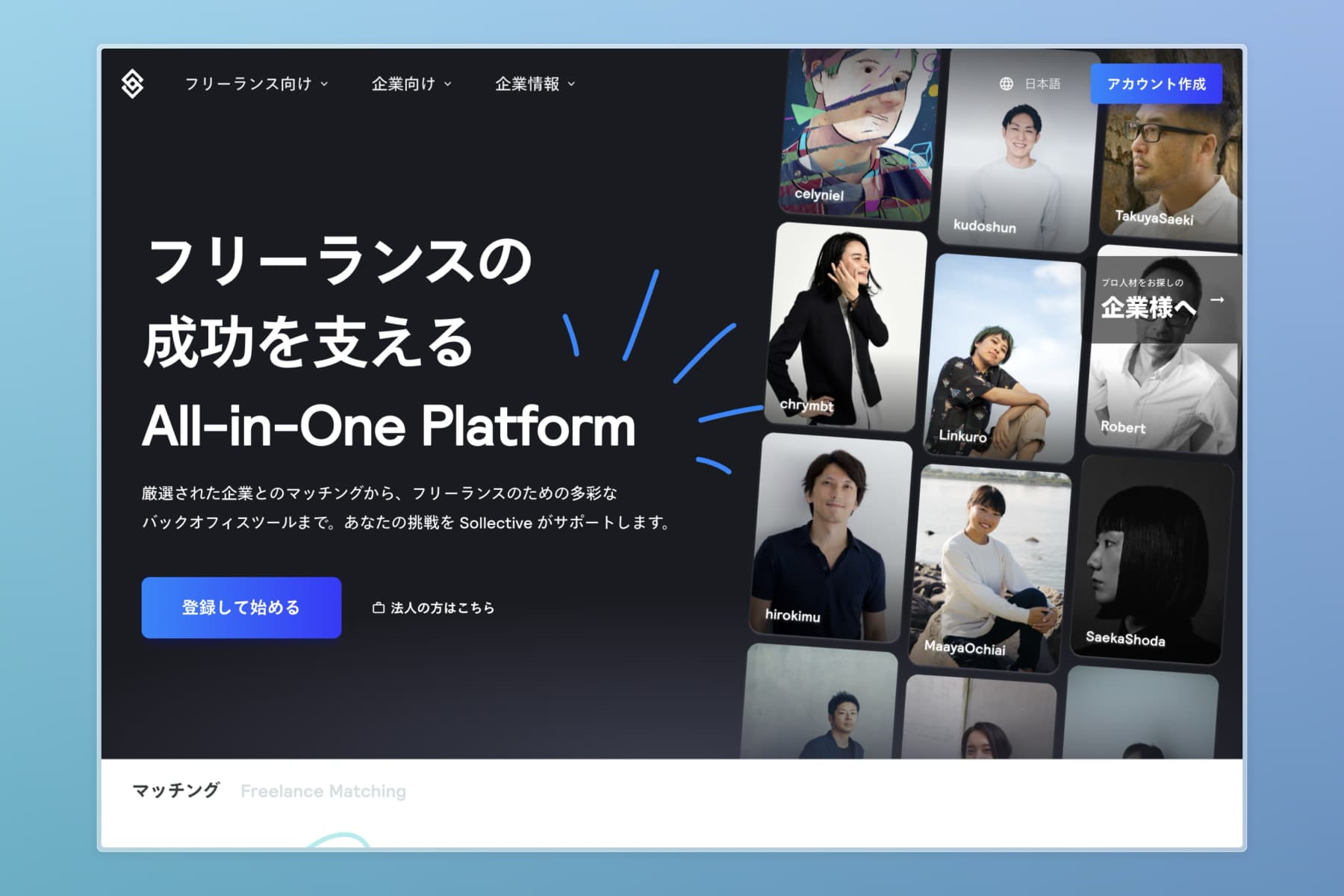
- Messaging Clarity: The platform's expanded value proposition was unclear, making it difficult for first-time visitors to grasp the breadth of services offered.
- User Engagement: The landing page lacked the narrative flow to keep users engaged, leading to high bounce rates.
- Outdated Visuals: The design no longer reflected the company's dynamic and growing identity.
- Target Audience Focus: The mixed messaging confused freelancers and business users, diluting the impact for both groups.
The overarching challenge was to align the website's design and messaging with Sollective's brand mission: "Prove the value of freelance." This meant showcasing the platform as a hub for professional growth, collaboration, and efficiency.
The Approach
Structuring the narrative
We started by focusing on storytelling. The landing page needed to:
- Be approachable and welcoming to first-time visitors.
- Clearly articulate the platform's value to freelancers, answering key questions upfront:
- What is Sollective?
- Why should I join?
- How does it benefit me?
To streamline communication, we separated freelancer-focused messaging from business-oriented content, moving the latter to a dedicated B2B site. This allowed us to craft a targeted narrative tailored specifically to freelancers.
Redesigning the Page Flow
We restructured the landing page into distinct sections:
- Showcasing Freelancers: Highlighting success stories to create relatability and inspire trust.
- Projects and Matching: Demonstrating how the platform connects users to meaningful opportunities.
- Core Features and Benefits: Breaking down functionality with an emphasis on usability and efficiency.
- Case Studies and Reassurances: Sharing testimonials and proof points to build credibility.
- Workflow Tools: Introducing the tools that streamline freelance work.
- Community and Ecosystem: Highlighting the value of collaboration and off-platform initiatives.
This logical progression ensured a seamless flow, guiding users from discovery to action.
Leveraging Framer for Rapid Development
We used Framer to build the site, enabling:
- Fast Iteration: Rapid prototyping and deployment to keep pace with business needs.
- Custom Functionality: Tailoring components for unique interactions and animations.
- Engaging Visuals: Playful animations and ready-made assets created a sense of curiosity, encouraging exploration.
The Solution
The redesigned landing page effectively addressed the challenges:
- Clear Messaging: Users immediately understand Sollective's offerings and benefits.
- Engaging Design: A refreshed visual identity aligns with the brand's dynamic growth and mission.
- Focused Targeting: Freelancer-centric messaging resonates with the primary audience.
- Optimised Flow: Logical content structure keeps users engaged and guides them to sign-up.
The Results
The redesign delivered measurable improvements:
- 50% Increase in Average Engagement Time: Users spent more time exploring the platform.
- Improved Clarity: Feedback from usability testing showed users better understood the platform's value.
- Higher Conversion Rates: A more cohesive narrative and design boosted sign-up rates.
Key Takeaways
- Storytelling Matters: Structuring the page as a narrative helped retain user attention.
- User-Centric Design: Separating freelancer and business content improved focus and impact.
- Scalable Tools: Using Framer allowed for rapid, scalable design solutions that could evolve with the platform.